The invisible shapes: 7 easy-missing web design details
We must make the invisible kingdom visible in our midst.
—John Calvin
The problem
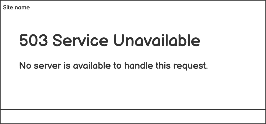
“Hey, the 503 error page looks like this, is it ok?”
As an Experience Designer, I’ve come across this kind of question about error page design many times. Sometimes it was noticed by developers when they were handling call responses. Sometimes it was QA engineers who distinguished such error pages while application testing. There were also times when I realised the error page design missing during desk check review or when I tested an application myself.
In a production environment, it shouldn’t be common for users to encounter service errors. And when such errors occur, it seems engineers are more nervous than designers. Yes, from experience design’s point of view, when a service is down, any web browsers would at least show some default error message to tell what happens, e.g. “503 Service Temporarily Unavailable” (as the image above). However, for normal people who are not IT professionals, this kind of default message may read scary. Users may think they’ve done something wrong and don’t know what they can do next.
I rarely listed the error handling screen design into design roadmaps in my past projects, nor was I conscious about counting it in the next project even if it is a low priority.
“Hey, it doesn’t matter.” “Really?”
Although I’ve never been blamed for not thinking of such designs in the first place, the fact is that this kind of common screen that would affect users’ experience on an application becomes invisible when I planned the work of design.
For me, these kinds of design tasks look like ”invisible shapes“. They commonly exist in almost all products and services we deliver, but as design deliverables, they are easily overlooked by designers.
How to make the “Invisible shapes” visible?
To learn the lessons and grow into a more professional designer, I’d like to put those distinguished “invisible shapes” to the table by creating a checklist. Dive into the impact of each on user experience, exploring examples as well as proper tools for deliverables.
Hope this checklist can inspire designers, developers, testers and any product related team members on high quality product delivery. And welcome anyone who also suffers similar issues to contribute your idea and fulfil the list. May the idea in the checklist shapes more efficient design practices on detail design, and level up our competencies on design planning and deliverable quality for delivery projects.
Make the “invisible shapes” visible
The 7 design objects that deserve your attention
- Error page
- Favicon and page title naming rules
- Leave site confirmation
- Cursor styles
- Display numerals: font, alignment and formatting
- Deal with long characters
- Text area resizing
When starting with a new delivery project, you may refer to the checklist above and create tickets for applicable items in the backlog. So that you won’t forget the details and your team can consider all these necessary items in the iteration planning and less last-minute calls.
Let’s deep dive into each design object below.
1. Error page
When working on the web, an error page would appear when a server responds to a browser’s request with error status code. For web designers, error page design is about how to inform users of the error status in a human-readable message and visual clues.
Technically, there are tens of HTTP status code (refers to The list of HTTP Status code on Wikipedia) that a server may respond to a browser’s request and following categories are the two typical error categories:
- 4xx client error – the request contains bad syntax or cannot be fulfilled
- 5xx server error – the server failed to fulfil an apparently valid request
From designer’s perspective, to make error types easier for users to understand and take appropriate actions, please consider at least two typical types of error screens as listed below:
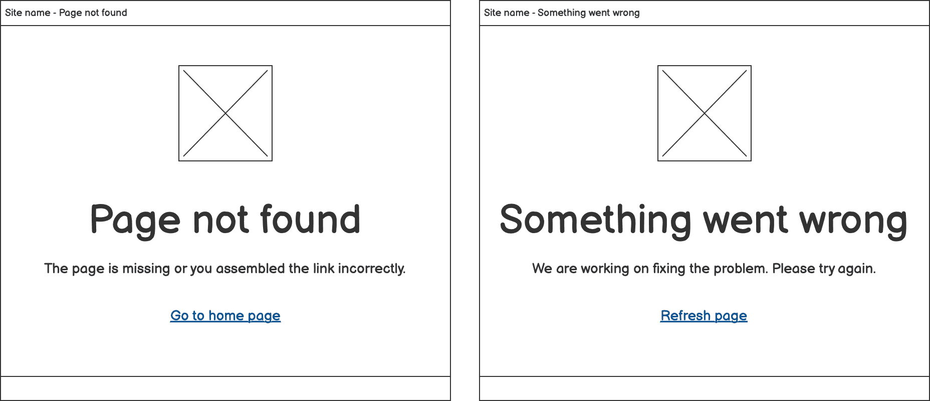
- Page not found. Show this screen when a page users try to access doesn’t exist. This may be caused when users input wrong urls or do not have access permissions. Since users have nothing to do with this page, a common alternative action for users is to guide them “Go to home page”.
- Something went wrong. This is for the other technical errors such as 503 server error. This kind of error may impact site wide. Developers would be alerted once this kind of error happens as normal practices and they would try to fix the problem as soon as possible. If errors are fixed, people can refresh the page to get a work site; if issues are still pending, people have to wait until errors are mitigated or fixed.
Example
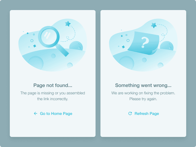 Error states: 404 and 503 pages by Yuliia Maslienikova on Dribbble
Tips for delivery
- Error pages can be customised via the front-end so that you can design them in UI design tools.
- Use appropriate visual graphics to help users relax instead of letting them feel they did something wrong.
- Make copywriting clear and easier to understand especially when users are non-IT professionals.
- Learn the technical mechanisms from engineers. They may help you to understand the context better, so you can balance user needs and technical facts smartly.
2. Favicon and page title in browser tabs
When using a browser-based web service, the first thing that comes to people’s eyes is the icon and page title displayed on the browser tab.

However, as designers, if we are used to creating UI frames for the main content design in no-code UI design tools like figma or sketch, we usually forget about these small pieces of elements that also affect user experience.
What may happen if page title naming rules are not specified?
⚠️ Not-to-follow example 1: One site name appears across all different pages
 If different pages under the same site opened at the same time, it would be difficult for people to identify page content via the page title in browser tabs. People need to click through all the tabs and remember the order before they can tell the content.
⚠️ Not-to-follow example 2: No favicon
 Favicon is short for “favourite icon”. It is a file containing one or more small icons (learn more in Wikipedia). Once included, the icon would appear in the web browser address bar, browser tab, bookmarks, etc.
Favicon usually indicates a brand. If people already have impressions on a brand, a favicon with branding elements can help people quickly identify the brand site if they open multiple browser tabs for different websites. It is not really a problem if no favicon is specified for a website, but if there is an appropriate icon applied, it would allow people to locate a website tab more quickly.
The above not-to-follow situations may happen if designers didn’t specify page title naming rules or provide a favicon for developers to implement.
Example
Thoughtworks official website is a good example on how titles on browser tabs should be named:

Tips for delivery
-
Favicon design is still a graphical work that designers can ship via UI design tools like figma or sketch. Just please add a ticket in the backlog to make sure favicon design and implementation is under review.
-
Page naming rule is more about UX copywriting. Figma or sketch may not be a good channel for delivery. A sitemap or an information architecture in mind map may help designers explore the site structure for proper naming rules. You may include a table list with the naming structures and examples in a task ticket for developers references.Below is a page naming rules example table I created based on the Thoughtworks website.
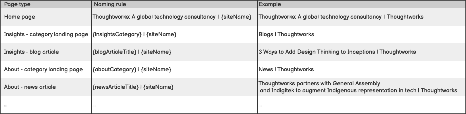 Page naming rule delivery example bases on Thoughtworks official website in 2022
3. Leave site confirmation
When designing user interfaces for forms, it is common to define form validation styles when mandatory fields are not filled or invalid values exist. However, what if a user closes browser tabs when there are changes on the page not yet saved? Users may lose all the changes on the form and need to start filling in the form again. It feels like shutting down a computer without saving a Word document and losing the content you’ve worked so hard on.
More than designing a change not saved alert within a web application frame, we need a browser-level alert to remind people that they are leaving a page with changes not saved when the exit behaviour is triggered on browser level.
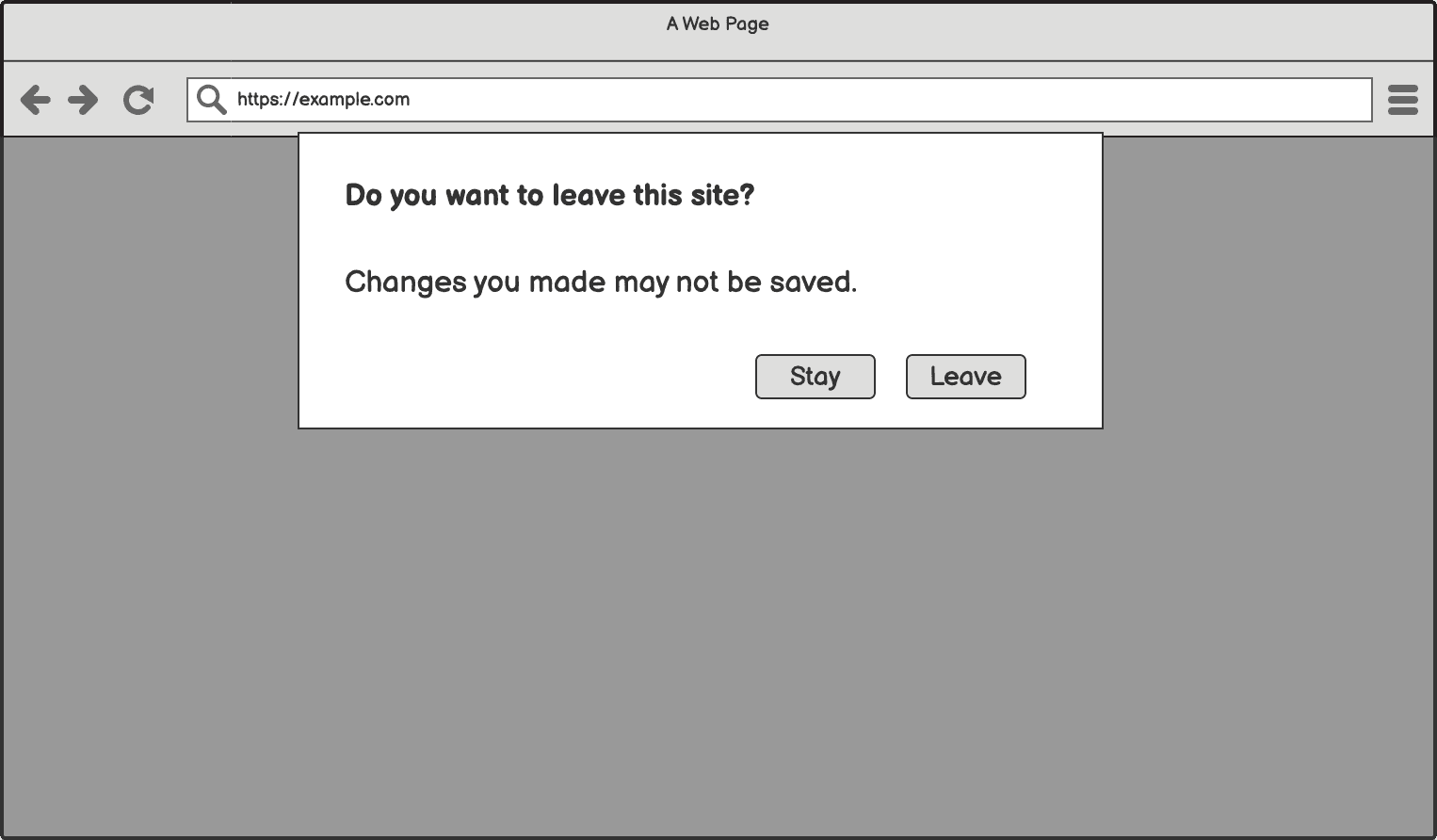
Example
In Gmail, when composing an email and closing browser tab immediately, a “Leave site?” modal would pop up and ask people to confirm leave and inform them that “Changes that you made may not be saved”.
 “Leave site” confirmation in Google Chrome (version 103)
The Atlassian Confluence page editing view would also show this browser-level “Leave site” confirmation when users close a page without saving it.
Although applications such as Gmail and Confluence already provide auto save functions, the apps still do “Leave site” confirmation as a double insurance to avoid creating trouble for users.
Tips for delivery
“Leave site” confirmation is a browser based dialog. It doesn’t need designers to design a branded user interface as it is non-customisable. You may attach the “Leave site” screenshot in the design file for handoff with developers. More importantly, add this case as an acceptance criteria (AC) in stories for forms.
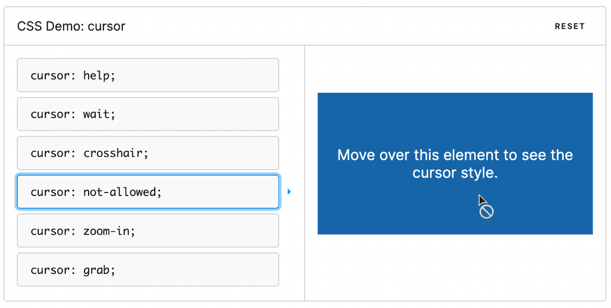
4.Cursor styles
When people use a web service on a desktop, cursor is everywhere. In general web browsing experience, people would use a mouse to scroll, locate and interact with elements on a page with their eyes following the cursors. Thus, the cursor becomes a tiny but efficient communication medium between user interface and users.
When designing user interfaces to interactive elements, instead of only thinking about how interactive elements such as links, buttons and form fields should look like under different states (default, hover, focused, clicked, etc.), we should consider cursor styles in and maximise the use of available cursor styles.
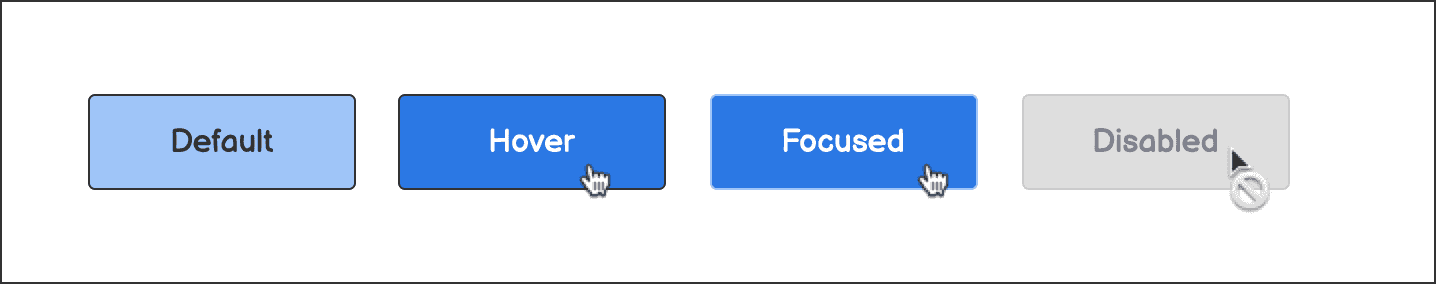
Some cursor styles could be automatically applied in web browsers when proper HTML tags are applied. For example, when a standard <a> tag is applied for a link, when mouse over, the cursor will auto load the pointer style which doesn’t require additional CSS property definition. And when mouse over plain texts, the cursor becomes text styles.
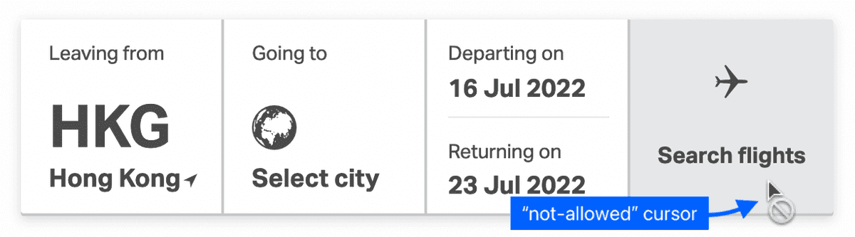
However, most cursor styles in the standard CSS cursor dictionary won’t be loaded automatically and need to be specified when implementation. For example, a disabled button would still show with default cursor style when hovering. It only loads the not-allowed cursor styles when cursor: not-allowed; is specified.
Example
On the Cathy Pacific website flight search, a “not-allowed” cursor would appear when mouse hovering the “Search flights” button when the search form hasn’t been completed.
In MDN web docs - CSS - cursor, you can see the demo of the cursor by different CSS cursor attributes. There is also a well organised syntax which includes categories, keywords, examples and description per cursor style.
Tips for delivery
- Keep cursor styles in mind when designing interactive elements for desktop applications.
- In design files, add special cursor styles definition together with interactive elements within a scenario. You may reuse cursor symbols from existing design files in figma or sketch.
- In story tickets, add UI specification on cursor styles for the special cursor cases.
- Testing. Make sure cursors are loaded properly for all states.
5. Display numerals: font, alignment and punctuation
When designing numbers for user interface display, it looks straightforward to design numbers as how we design for the other texts on a website. Generally yes, numbers are part of texts that could be nothing special if numbers are in low priority for information communication.
However, under certain circumstances such as displaying a stock list, when numbers deliver information such as amount, portfolio number, quantity, rating in one screen, it could impact on the readability. If appropriate fonts are selected with correct alignment and punctuation applied, the numbers in a tabular could be easier for the user to digest the information from the numbers.
For design objects that are “number oriented”, designers should take serious of the design of numbers and ask questions to check if the numbers are designed in appropriate manner from the following aspects:
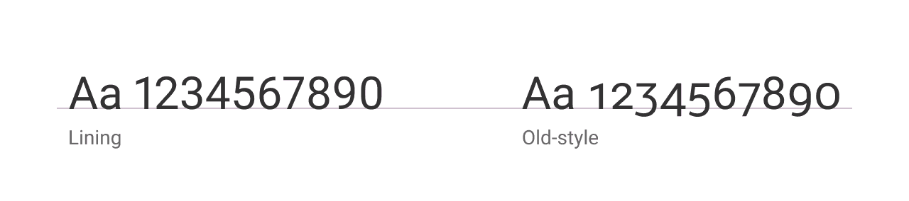
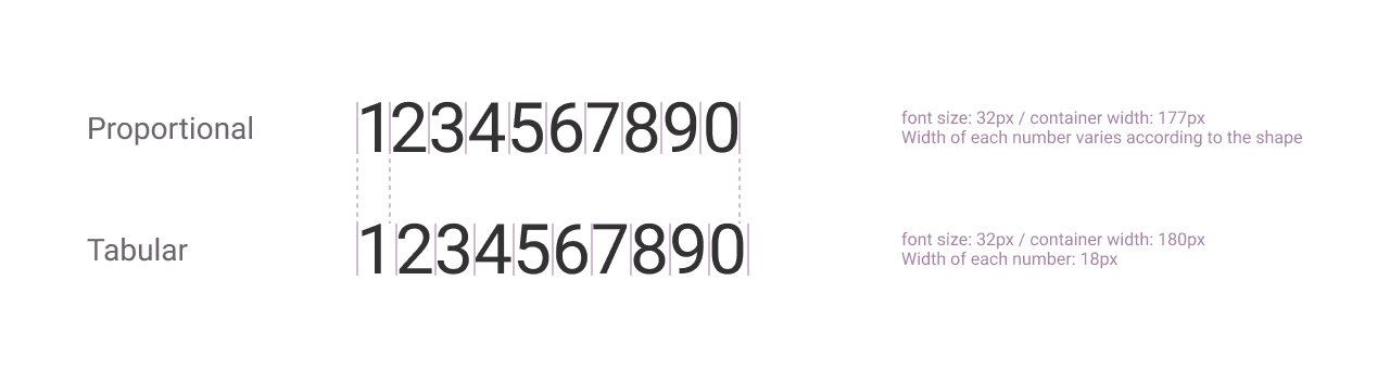
5.1 Number font
Make sure the proper font has been selected for numerals display. Understand the attributes behind the differences in display numerals:
Lining v.s. old style
Spacing: proportional v.s tabular
The article ”Type talk: Know Your Figures” is a good read to learn the subtle differences in the way numbers can be displayed.
Tips for delivery
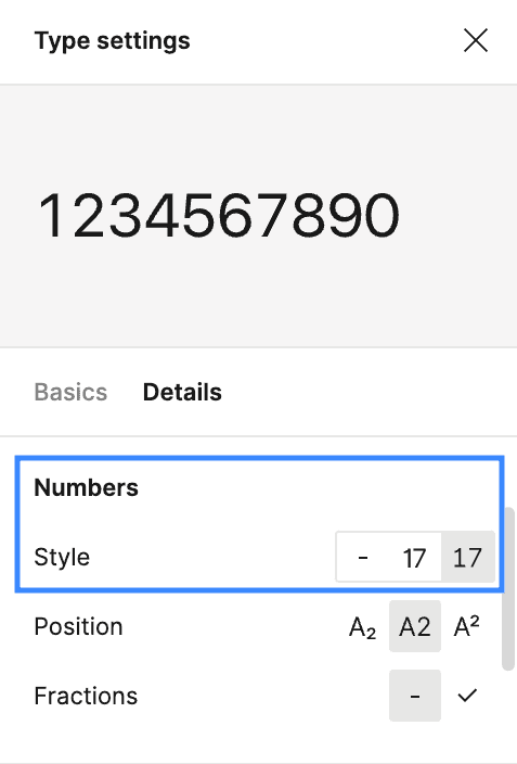
- Check if there are specifications for numeral displays in existing brand guidelines or design systems for directly use
- In figma, you may find a number styles configuration panel for selected text under the “Type settings”.
To quickly get some ideas on the fonts that could be good for numeral display, the article ”40 Best number fonts: free and paid” by JUSTINMIND could be a start point.
5.2 Number alignment
Question: Is it a standard “to left justify text and right justify numeric values. ”
Answer: “Yes English text is usually left-aligned. Numbers are normally aligned so that the various places (unit, tens, etc.) are in columns. If the numbers are integers, this just means right-aligning the numbers. If they have decimal fractions, then the decimal places should be aligned, with the units digits all in a vertical line.” — A Q&A on User Experience Stack Exchange
When designing numbers displayed in tabular, we’d better follow the above ‘standard” to make numbers better aligned. Good number alignment make data value easier to read as well as to compare or to calculate especially in a tabular.
Example
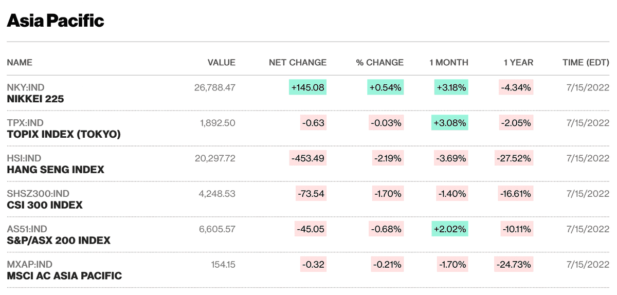
Bloomberg has all the numeric data columns aligned to right which make the stock list data easier to be compared by market.
Tips for delivery
Financial services usually have high demand on number display. You may refer to existing financial apps for number alignment design ideas.
5.3 Number formatting
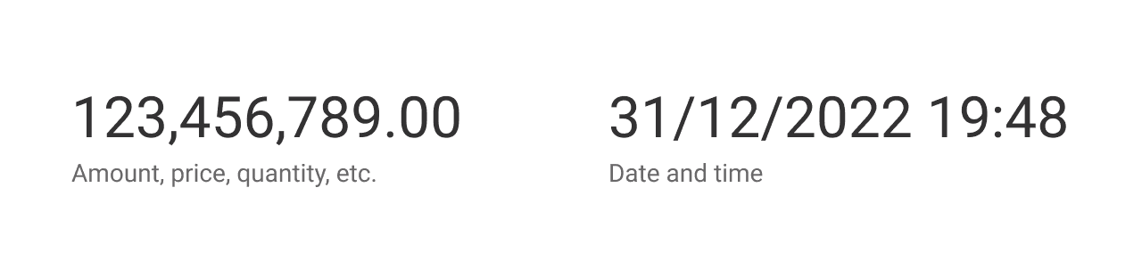
Always ask what numbers are used for and check if special formats are needed. A typical example is the display for amount, price or quantity that thousand separators and decimal places could usually be needed to make numbers easier to distinguish. Another example could be the display of date and time.
One of the key things that decide what format to use for numbers is users’ habits or the language standard. It would be good to check if the users are from various language backgrounds and need localisation for value or date time display. There may also be an existing editorial style guide as part of the brand guidelines which can guide you what format to use for consistency.
Tips for delivery
- For number fonts, you should directly use right fonts in design files. Sometimes the number fonts look similar to text fonts so that it’d better highlight font names in the file as well as in the story ticket as UI notes
- For numbers alignment, defining it in a UI mock-up should be enough. Alignment is a visual property and should be straightforward for recognition.
- For number formatting, more than reflecting the design in UI mock-up, you’d better specify the format details in story ticket to make sure engineers are aware of it and estimate the efforts in advance.
6. Deal with long characters
When adding in dummy text for UI design, most of the time we only fill in the content that matches the container size perfectly. However, when it comes to the implementation stage, developers have to come to us and ask how to deal with cases when characters are too long. Then we may rush to deliver a truncate case and count the maximum characters to be displayed.
We should avoid last-minute design for long characters and consider such cases ahead.
Handling long characters is not difficult but requires dedication. There are following common practices:
- Truncate characters. Set maximum character numbers and replace exceed characters with three dots ”…” or set the limit to container width and maximum numbers of lines. In such case, designers should also define how to allow people to read complete content. Mouse hover truncated text and show content could be one way; put a “more” link and allow users to expand a section to read more; put a link to redirect users to a new page to read full content would be another option.
- Line wrap. If there is enough space in vertical direction and there is no visual limitation on horizontal alignment, you may choose to wrap line for long characters.
Example
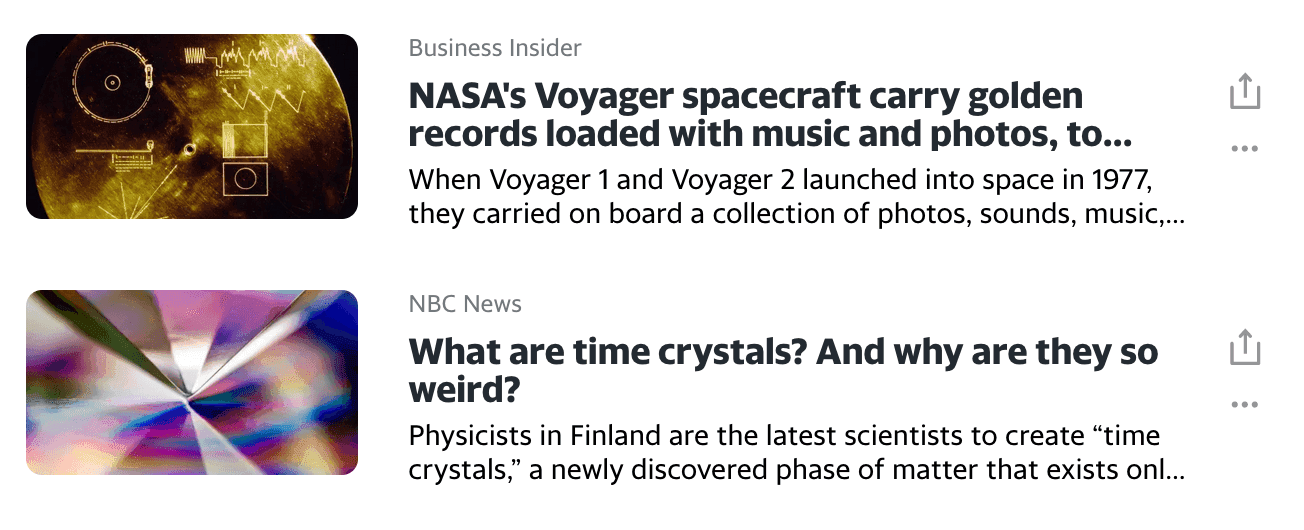
Yahoo News truncates news titles and descriptions that exceed two lines of the container width.
Tips for delivery
In the design file, adding examples of long characters cases would be straightforward. It’d better specify these details in story tickets as UI notes can prevent developers or you from forgetting these details.
7. Text area resizing
When designing a text area for people to enter long texts, we’d better consider whether or not a text area should be resized. However these tiny details may easily be forgotten if businesses or users do not mention it in advance and our designers may simply define a fixed size for the text area in the design file and do the work.
“I’d like to write down all relevant information via the comment box for my own notes…I want a big box!” - A voice from a user I interviewed.
Some people like to jot things down in as much detail as possible, while others prefer to keep content short. Some business scenarios want to provide an open space for people to share ideas, while others need to limit the length of content to regulate output. By considering the use of text areas and the need for resizability, we will provide a more adaptive writing experience for people to get their work done.
There could be 5 different practices for text area resizing interaction, we’d better make it clear to developers on which practice we want to apply for each text area, this may help developers better estimate implementation efforts.
- Non-resizable
- Automatically resizable
- Manually resizable
- Automatically and manually resizable
- Specific size options (e.g. fullscreen)
Example
When a text area is achieved by using the HTML tag <textarea> , a resize grabber would show in the bottom right corner by default. This grabber allows people to manually resize the text area in specified directions. It can be hidden or be customised with alternative styles.
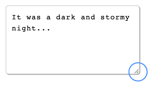
Screenshot from MDN HTML Demo for textarea
The resize grabber styles can be customised in CSS3 as the example below:
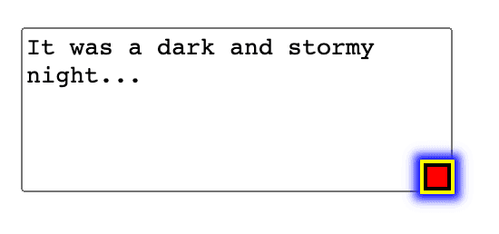
Example from stack overflow
Tips for delivery
- Write down how you want text area to be resized into acceptance criteria (AC)
- This resizable feature may need more efforts if the interaction would be achieved in automatic ways or with special visual styles, discuss it with developers and the team as early as possible for better planning
The above are the seven “Invisible Shapes” I experienced and would like to wrap up and share with you for references. Based on different experiences, you may think of other design objects that should be considered but are easily overlooked. Feel free to add your thoughts to help expand this list.
Reference resources
- The list of HTTP Status code
- Error states: 404 and 503 pages by Yuliia Maslienikova on Dribbble
- MDN web docs - CSS - cursor
- Favicon - Wikipedia
- Cathay Pacific
- Type talk: Know your figures by Ilene Strizver on Creative Pro
- 40 Best number fonts: free and paid” by Rebeka Costa on JUSTINMIND
- Is there a standard “to left justify text and right justify numeric values.” on User Experience Stack Exchange
- Bloomberg - Markets - Stocks
- MDN HTML Demo for textarea
- Can I style the resize grabber of textarea? on stack overflow